The Office of Communications launched a new version of the Amherst website on Wednesday, March 16. An email sent to members of the college community on March 9 announced the new website’s release.
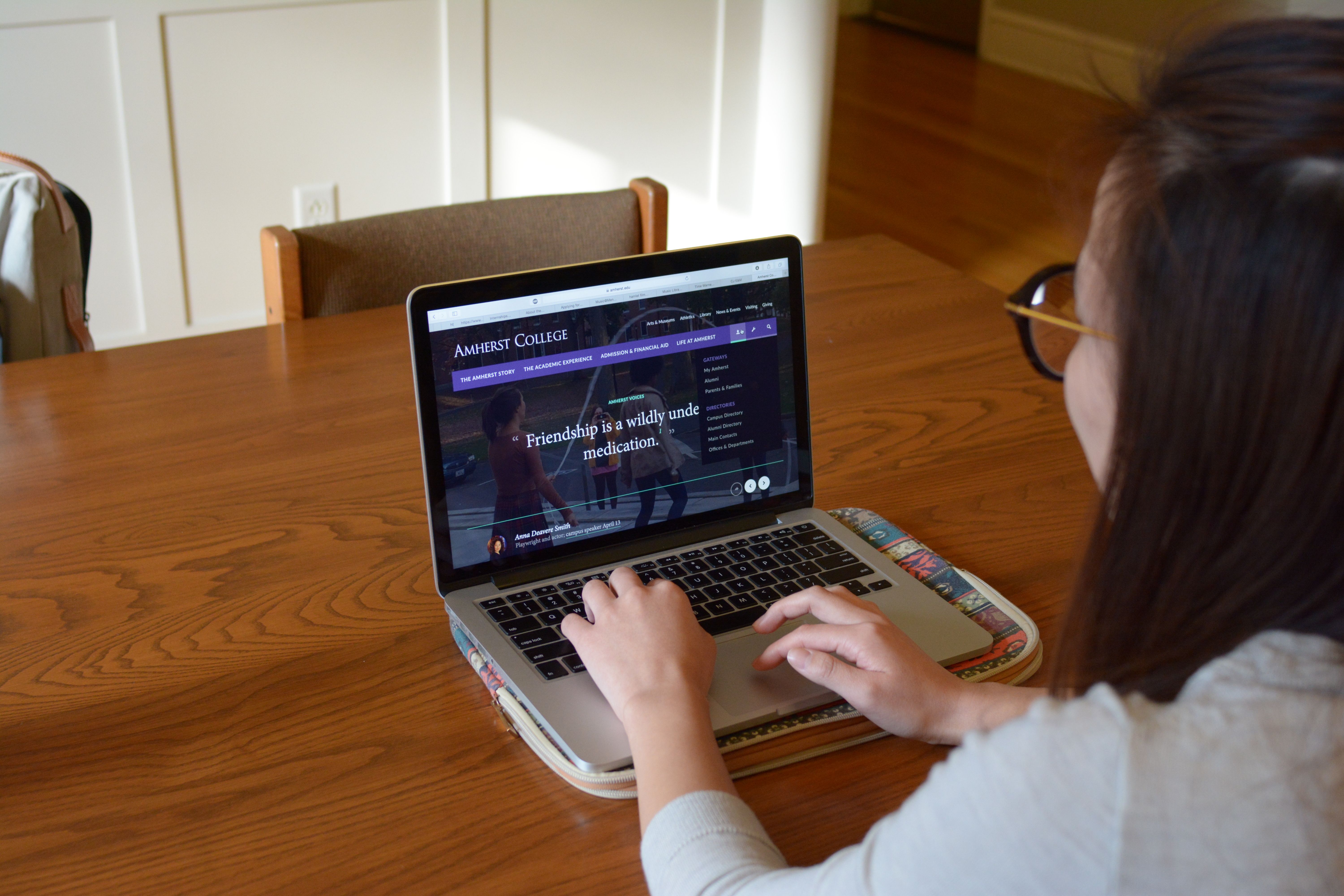
The website has been extensively redesigned, featuring a simplified homepage structure intended for easier use on all devices, including mobile ones. The new format also uses photos and videos in order to be more visually appealing.
“Mobile devices, social media, the attention to visual media and the hyper-connected society have all affected the way users interact with websites,” chief communications officer Pete Mackey said in an email interview. “We felt it was past due to offer an Amherst College site that was responsive to today’s web users.” Mackey said that the last time the college’s website underwent an extensive renovation was nine years ago in 2007.
Originally slated for January, the launch was delayed until spring break to provide Communications and Information Technology more time to work on the structure and design of the website, as well as to assist academic departments and administrative offices in adapting their own web pages to the new format.
“Along the way, we also re-wrote huge amounts of content to present it with a writing style that is more personal and friendly for web readers,” Mackey said.
The Office of Communications created the new website in partnership with the Information Technology department, and integrated the new format with content from the previous version of the site. For the website’s new design, the college hired Fastspot, a website design and development firm that has worked with other schools and organizations such as Yale University and Kenyon College.
A major change to the user experience on the website is the organization of content into four major fixed tabs at the top of the page, labelled “The Amherst Story,” “The Academic Experience,” “Admission & Financial Aid” and “Life at Amherst.” Content within each tab is arranged vertically, which, according to Mackey, is an effort to make the site easy for users to scroll through.
“I like the look,” Thomas Lam ’18 said. “But I can’t see my entire schedule without scrolling.”
The overall user interface has been simplified, which Mackey said provides a more flexible digital platform to present a variety of visual and text content formats. The new website also simplified navigational trees, making it easier for users to find specific information on the site without having to go through multiple levels of content.
“If you zoom out two or three times, it’s much easier to take in visually — everything seems really big,” Kenny Kim ’17 said.
Immediately upon opening the Amherst homepage, users are met with a panel called “Amherst Voices,” which presents a short quote from alumni, faculty or students with a link to share or repost it on a variety of social media platforms. When users scroll down further, the website presents statistics about the college, multimedia content and a sample of currently offered courses. The new website also features a digital map and virtual campus tour tool for visitors to learn more about the physical layout of the campus.
Mackey said that the conceptual work on the website’s redesign began in 2014, and the actual programming and building of the new site began in the fall of 2015. The Office of Communication and Information Technology tested the site and sought feedback through forums open to the campus and materials shared with faculty, parents and prospective students during the design process.
“The conceptual phase of a new website is always demanding because it entails trying to express the mission of the college in a rapidly changing digital medium,” Mackey said. “We also were moving from a site that was nearly nine years old to a completely new design, which made the programming phase especially complex and time-consuming.”
“I like that they’re changing things up, but I liked the old website, so I don’t understand why they had the need to create a new design,” Grace Karanja ’18 said. “But I don’t necessarily hate it.”
However, according to Mackey, the new website was easier to launch than the previous version from 2007.
“Those of us in IT and Communications who have been involved in web redesigns before, and some of us who have been involved in multiple such experiences over the last 15 years have all agreed that this redesign has resulted in less problems and complaints than any site we’ve ever been associated with, including the launch of the prior site,” Mackey said, adding that most of the problems so far have been minor issues such as broken links and typos.
“The best part was the day we actually launched the site,” Mackey said. “After so many months, and so many people devoting energy to this project, it’s always exciting to finally share the new site.”
